Why Your Button Is Blue (and Why It Matters)
Open ten random apps and count the blue buttons. Facebook, LinkedIn, PayPal, Twitter of old, countless banking apps. Designers sometimes treat this as a failure of imagination. It isn't. It's one of the most successful conventions in interface design.
Learned behaviour is a feature
Early web browsers showed hyperlinks in blue, underlined. For decades, billions of people learned that blue means "you can click this." That learning is free usability. A user who sees a blue button doesn't need to think. Every bit of thinking you remove from an interface is a small gift to your user.
Blue is practical
- It contrasts well with white backgrounds.
- It's one of the colours that remains distinguishable for most types of colour vision deficiency, especially red-green, which affects around 1 in 12 men.
- It doesn't carry strong warning meanings like red (danger) or yellow (caution).
The accessibility maths
The contrast between text and its background is measurable. The Web Content Accessibility Guidelines (WCAG) ask for at least 4.5:1 for normal-sized text.
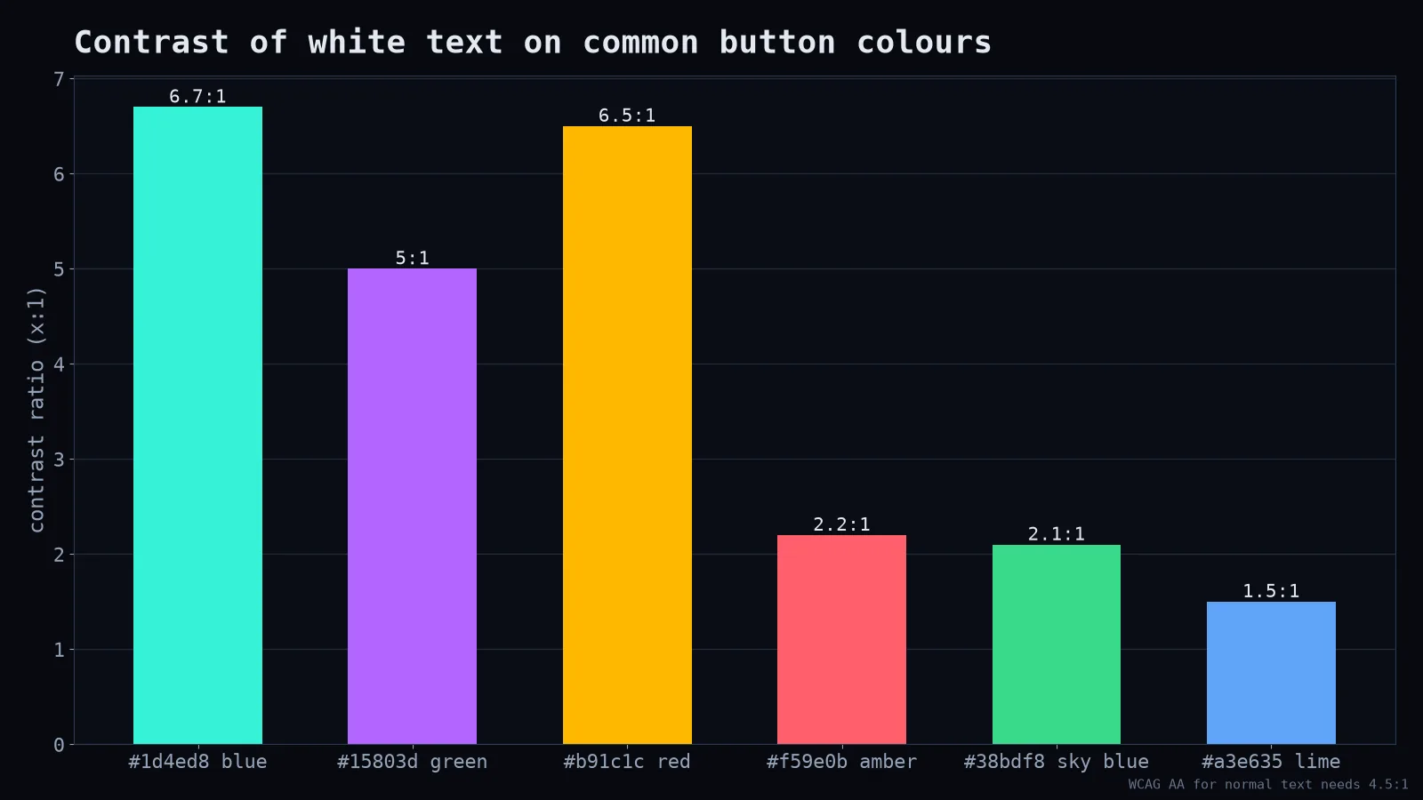
Deep blues, greens and reds pass easily with white text. Trendy bright colours like amber, sky blue or lime often don't. That neon-lime button might look great in your Dribbble shot and be unreadable on a phone in sunlight.
.button {
  background: #1d4ed8;   /* 6.7:1 with white text */
  color: #ffffff;
}
.button:focus-visible {
  outline: 3px solid #93c5fd;
  outline-offset: 2px;
}
That focus style matters too: people navigating with a keyboard need to see where they are.
When to break the convention
You don't have to use blue. You need to be consistent and clear:
- One primary colour for one primary action. If everything is bright and important, nothing is.
- Secondary actions look secondary. Outlined or neutral buttons for "Cancel," "Back," "Maybe later."
- Destructive actions look different. Red for "Delete account," ideally with a confirmation step.
- Match your brand, carefully. If your brand colour is orange, pick a deep enough orange to pass contrast, or use dark text on it.
Don't rely on colour alone
A button should look like a button even in black and white: a shape, a clear label, maybe an icon. Colour-blind users, people with bright sunlight on their screens and people with cheap monitors will thank you. So will your future self when the marketing team decides to change the brand colour.
The bigger lesson
Good design is often about using what people already know rather than inventing something new. Originality is great for your logo, your illustrations and your voice. For the button that takes someone's money or saves their work, boring and obvious is a compliment. Blue isn't lazy. Blue is a habit millions of people already have, and good design rents habits instead of fighting them.