Dark Mode: A Love Letter with Contrast Ratios
I love dark mode. My editor, my terminal and this very website are dark. But I've also built dark themes that looked gorgeous in a screenshot and gave people headaches after ten minutes. Here's what I learned, mostly the hard way.
Mistake 1: pure black and pure white
White (#FFFFFF) on black (#000000) has the maximum contrast ratio of 21:1. That sounds great, but for long reading it can be harsh: bright text on a pure black background can appear to glow or smear, especially for people with astigmatism.
Better: a very dark grey or navy background, and off-white text.
:root {
  --bg: #0f172a;        /* deep slate, not pure black */
  --text: #e2e8f0;      /* soft white */
  --text-muted: #94a3b8;
}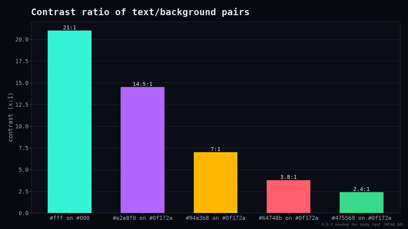
The trick is staying comfortable without dropping below accessibility thresholds. Muted grey text is lovely until it becomes unreadable.
Mistake 2: just inverting the light theme
Shadows don't work the same way on dark backgrounds; you can barely see a black shadow on a near-black page. In dark themes, elevation is usually shown with lighter surfaces: a card is slightly lighter than the page, a modal lighter still.
.page  { background: #0f172a; }
.card  { background: #162033; }
.modal { background: #1e293b; }
Mistake 3: saturated colours
That vivid brand blue that looks fine on white can vibrate painfully against a dark background. In dark mode, use slightly lighter, less saturated versions of your accent colours. Many design systems define separate accent tokens per theme for exactly this reason.
Mistake 4: forgetting images and charts
Screenshots with white backgrounds become flashbangs in a dark interface. Charts with black axis labels disappear. Logos with dark text vanish. Audit your media: provide dark variants, add subtle borders around light images, or reduce their brightness slightly.
Respect the user's choice
Let the operating system decide by default, and let people override it:
:root { color-scheme: light dark; }

@media (prefers-color-scheme: dark) {
  :root { --bg: #0f172a; --text: #e2e8f0; }
}
The color-scheme property also tells the browser to style scrollbars and form controls appropriately, which saves you from a bright white checkbox in an otherwise dark form.
Is dark mode better for your eyes?
It depends. Many people find it more comfortable in dim environments. In bright light, dark text on a light background is often easier to read. It can save battery on OLED screens. It isn't universally "healthier." That's why the best answer is to offer both and let people choose.
The love letter part
When it's done well, dark mode feels calm, focused and a little cinematic. Content glows, chrome recedes, and late-night work feels less like staring into a lamp. It just takes more than filter: invert(1). Design it like it's its own theme, because it is.