Colour Palettes for People Who Can't Pick Colours

Some people open a colour picker and see infinite possibility. I open a colour picker and see infinite ways to make something look like a 2004 MySpace page. If you're like me, you don't need more inspiration. You need a method.
Step 1: Start with neutrals, not colours
Most of any interface is background, text, borders and surfaces. Get those right first: a range of greys (or slightly tinted greys) from almost-white to almost-black.
:root {
  --gray-50:  #f8fafc;
  --gray-200: #e2e8f0;
  --gray-400: #94a3b8;
  --gray-600: #475569;
  --gray-800: #1e293b;
  --gray-950: #020617;
}
Tinting your greys slightly toward your brand colour (a hint of blue, a hint of warm brown) makes the whole design feel more cohesive than pure grey.
Step 2: Pick one accent
One. Your brand colour, or a colour that matches the feeling you want: teal for calm-tech, orange for energetic, deep green for finance-trustworthy. Use it for primary buttons, links and highlights. That's it.
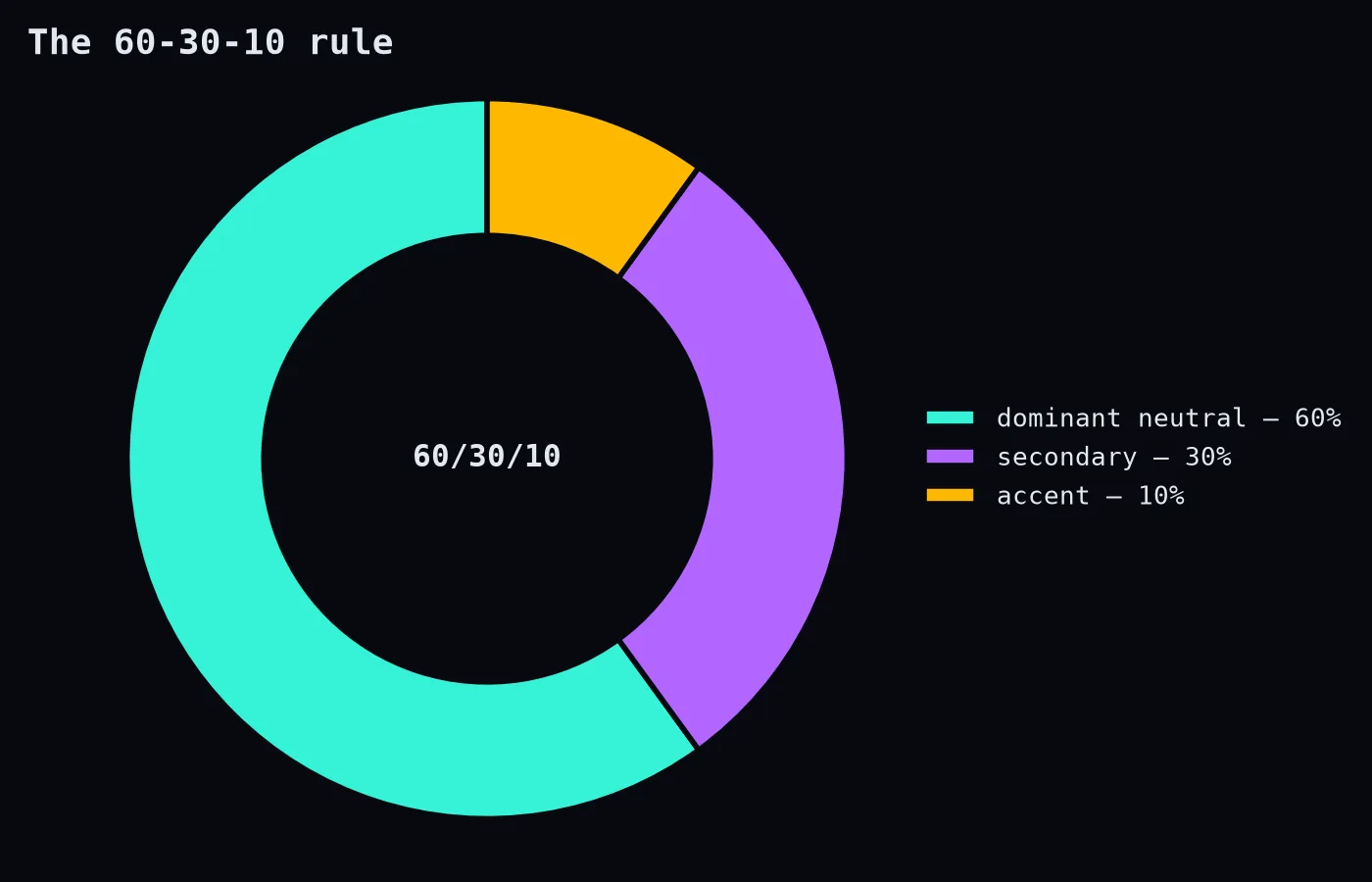
The 60-30-10 rule from interior design is a handy guide: about 60% dominant neutral, 30% secondary tone, 10% accent. The accent works because it's rare.
Step 3: Make shades of your accent
You'll need a lighter version for hover backgrounds, a darker version for pressed states and text, and maybe a very light tint for selected rows. Generate a scale from light to dark rather than inventing each one:
:root {
  --accent-100: #ccfbf1;
  --accent-300: #5eead4;
  --accent-500: #14b8a6;
  --accent-700: #0f766e;
  --accent-900: #134e4a;
}
Tools like the palette generators built into many design apps, or open-source colour systems, do this well.
Step 4: Add semantic colours
- Success (green): saved, paid, done.
- Warning (amber): be careful.
- Danger (red): destructive or failed.
- Info (blue): neutral notices.
Keep them consistent across the product. If green means success on one screen and "new feature" on another, people stop trusting colour.
Step 5: Check contrast
Every text/background pair should meet WCAG contrast guidelines (4.5:1 for normal text). Check your accent with white text and with dark text; one of them will usually pass.
Step 6: Check colour blindness
Use a simulator (many browsers' developer tools have one) to view your design as people with different types of colour vision deficiency see it. If success and danger become the same muddy brown, add icons or labels.
Step 7: Name colours by purpose
--color-danger survives a rebrand. --red-500 used directly in 200 places does not.
The secret
Good palettes are mostly restraint. Lots of neutral, a little colour, and colour that always means something. You don't need to "have an eye." You need a system, and the discipline not to add a ninth accent because purple was feeling left out.