Designing a Terminal Website (Yes, Like This One)
When people visit this site, they don't see a normal homepage. They see a terminal. Some type help. Some type hello. Some type something rude, and the terminal answers with a joke. I built it this way because I spend half my life in terminals and I wanted my website to feel like home.
But a gimmick can easily become a wall. Here's what I learned designing it.
Why a terminal at all?
- It's memorable. Nobody remembers the 400th portfolio with a hero image and three cards.
- It matches the audience. Many visitors are developers, students and researchers who enjoy the joke.
- It's interactive. Typing a command and getting an answer is a tiny game, and games keep people around.
The problem: not everyone speaks terminal
A blinking cursor is an intimidating interface if you've never used one. Recruiters, journalists and my relatives are not going to read a man page.
So the site has escape hatches:
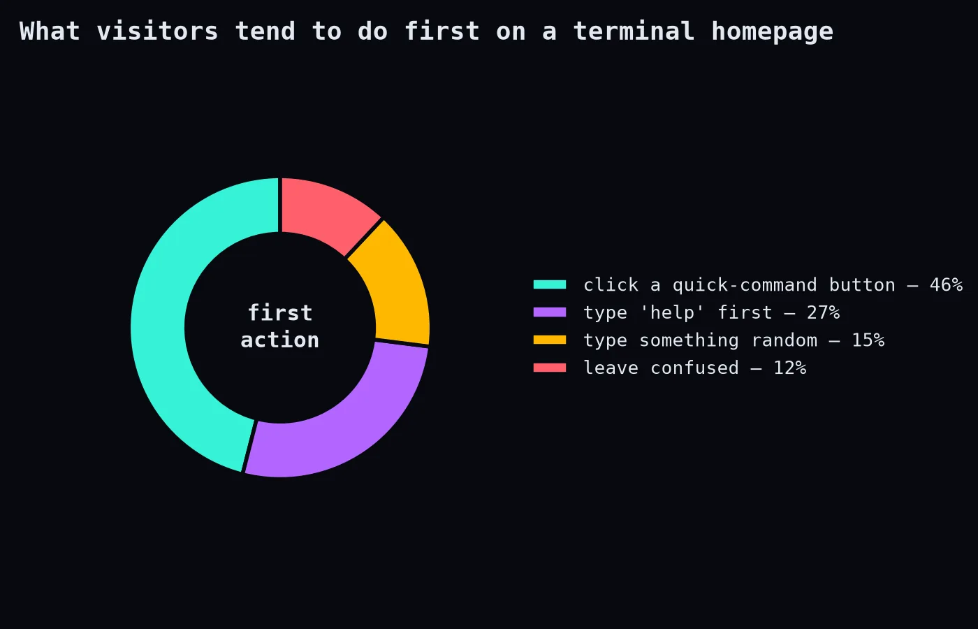
- Clickable quick commands. Buttons for the most useful commands (
aboutMe,myBooks,research) so nobody has to type. - A welcome guide on the first visit explaining what to do.
- Real HTML content outside the terminal: who I am, my research, links. If the terminal fails or JavaScript is off, the important information is still there.
- Friendly error messages. Typing a wrong command gets a joke and a hint, not "command not found."
- Plain pages for the blog, so posts can be read, shared and found by search engines without any terminal at all.
Design choices that helped
- A strong, limited palette: dark background, teal and violet accents, amber for warnings. Consistency makes it feel like one product instead of a costume.
- Monospace everywhere it matters, but readable sizes. Terminal aesthetics don't require 11px text.
- Typing animations that are short, and skipped for people who prefer reduced motion. Nobody wants to wait for a fake terminal to type out a paragraph.
- Mobile layout that stacks the terminal and the info cards, because typing commands on a phone keyboard is a special kind of suffering.
@media (prefers-reduced-motion: reduce) {
  * { animation: none !important; transition: none !important; }
}
Things I got wrong at first
- Too many commands. Over a hundred of them. Fun for me, overwhelming for visitors. The help output now highlights the handful that matter.
- Content only inside the terminal. Search engines and screen readers couldn't see it. Moving key content into real HTML fixed both.
- Heavy libraries. I was loading several CSS frameworks the page barely used. Removing them made the first load much faster.
The general lesson
A creative interface is great as long as it's a layer on top of a solid, accessible foundation, never a replacement for it. Let the playful version be the fun way in, and make sure there's always a boring, reliable way in too. The terminal is the personality. The plain HTML is the manners.