Whitespace Is Not Empty Space
Every designer has heard it: "There's a lot of empty space here. Can we add something?" The client means well. They paid for a website, and empty space feels like paying for nothing.
But that "empty" space is doing some of the hardest work on the page.
Spacing is how we group things
Our brains assume that things close together belong together. This is the law of proximity, one of the Gestalt principles of perception. A label sitting close to its input field clearly belongs to it. A label floating halfway between two fields is a puzzle.
So spacing isn't decoration. It's grammar. Small gaps say "these are related." Larger gaps say "new topic."
Spacing creates hierarchy
A headline with generous space around it feels important. The same headline crammed against the paragraph above it feels like an afterthought. Luxury brands use enormous margins because space signals confidence. Discount flyers fill every millimetre because they're shouting.
Spacing makes text readable
- Line length: about 50–75 characters per line is comfortable for reading. Wider, and eyes get lost returning to the next line.
- Line height: around 1.4 to 1.7 times the font size for body text. Tight lines feel like a legal contract.
- Paragraph spacing: a visible gap between paragraphs helps readers find their place.
article {
  max-width: 68ch;      /* comfortable line length */
  line-height: 1.65;
}
article p + p {
  margin-top: 1em;
}
Use a spacing scale
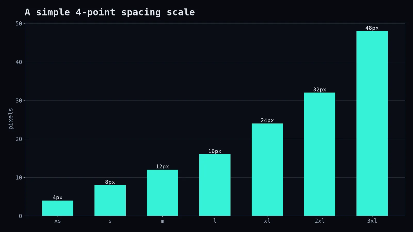
Random values (13px here, 17px there, 22px somewhere else) make layouts feel slightly "off" even when nobody can say why. A consistent scale makes everything feel intentional.
:root {
  --space-1: 4px;  --space-2: 8px;  --space-3: 12px;
  --space-4: 16px; --space-5: 24px; --space-6: 32px; --space-7: 48px;
}
.card { padding: var(--space-5); }
.card h3 { margin-bottom: var(--space-2); }
.section + .section { margin-top: var(--space-7); }
Rule of thumb: space inside a group should be smaller than space between groups.
How to win the client conversation
Instead of defending "minimalism," explain function:
- "The space around the call-to-action makes it the first thing people notice."
- "Grouping these fields reduces form mistakes."
- "Shorter lines mean people actually read the paragraph instead of skimming it."
Then, if they still want to fill the gap, consider whether the page is missing something genuinely useful, like a testimonial or a clear next step, rather than decoration.
The test
Squint at your design until it's blurry. Can you still see the groups and the most important element? If it's an even grey soup, you need more space, not more content. Whitespace isn't the absence of design. It's design you can breathe in.