Fonts Have Feelings: A Typography Crash Course
Write "We regret to inform you that your account has been closed" in Comic Sans and it sounds like a birthday card from a robot. Write "Happy Birthday, Grandma!" in a stern legal serif and it sounds like a court summons. Fonts have feelings. Your readers feel them whether or not they notice.
The main families
- Serif (Georgia, Merriweather): small strokes at the ends of letters. Feels traditional, literary, trustworthy. Great for long-form reading and editorial sites.
- Sans-serif (Inter, Helvetica, Roboto): clean, modern, neutral. The default of most apps and interfaces.
- Monospace (JetBrains Mono, Fira Code): every character has the same width. Essential for code, and a strong personality choice elsewhere. (Yes, this site uses one. I know. I'm a terminal person.)
- Display (anything decorative): for headlines and logos only. Never for paragraphs.
Rule 1: Two fonts are usually enough
One for headings, one for body text. Or even one font in two weights. Every extra typeface adds visual noise and loading time.
Classic pairings work because they contrast:
- serif headings + sans-serif body (warm and modern)
- sans-serif headings + serif body (modern and literary)
- a geometric sans for headings + a humanist sans for body (clean and friendly)
Rule 2: Use a type scale
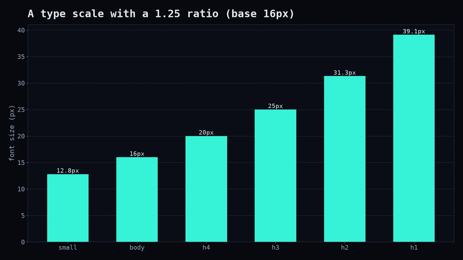
Pick a base size (16px for body text on the web is a sensible minimum) and multiply by a ratio for each step up.
:root {
  --step-0: 1rem;      /* body */
  --step-1: 1.25rem;   /* h4 */
  --step-2: 1.563rem;  /* h3 */
  --step-3: 1.953rem;  /* h2 */
  --step-4: 2.441rem;  /* h1 */
}
Rule 3: Hierarchy comes from more than size
Weight (bold vs regular), colour (dark vs muted grey), letter-spacing (wider for small caps labels) and space around elements all create hierarchy. A heading doesn't always need to be huge; it needs to be clearly different.
Rule 4: Readability beats personality for body text
For paragraphs, choose a font with generous x-height (tall lowercase letters), clear distinctions between similar characters (l, I, 1 and O, 0), and good support for every language you publish in. If you write in English and Bangla, like I do, check that both scripts look good and have compatible sizes, because a Bangla font at the same pixel size can look much smaller or larger than its Latin companion.
Rule 5: Load fonts responsibly
@font-face {
  font-family: "Inter";
  src: url("/fonts/inter.woff2") format("woff2");
  font-display: swap;   /* show fallback text immediately */
}
Only load the weights you use. Five weights of two families is a lot of bytes for a blog post.
About Comic Sans
Comic Sans is mocked by designers and loved by some people with dyslexia, who find its irregular letter shapes easier to tell apart. It's a useful reminder: "good taste" and "good for people" aren't always the same thing. Test with real readers.
Typography isn't about fancy fonts. It's about making reading effortless, and making the tone match the words. When nobody notices your font, you've probably chosen well.