UX of Error Messages: 'Something Went Wrong' Is Not a Message
"Something went wrong." Thank you. I had gathered that from the fact that nothing worked. It's like a doctor examining you carefully and announcing, "You are unwell."
Error messages are some of the most-read text in any product, because they appear exactly when people are frustrated. Yet they're often written last, by whoever happened to be coding the error handler at 6 PM.
Before and after
Form validation
- Before: "Invalid input."
- After: "Phone number should have 10 digits. You entered 9."
Password rules
- Before: "Password does not meet requirements."
- After: "Add at least one number to your password." (And show the rules before people type, not after they fail.)
Payment declined
- Before: "Transaction failed. Error 402."
- After: "Your bank declined this payment. Check the card details or try another card. You haven't been charged."
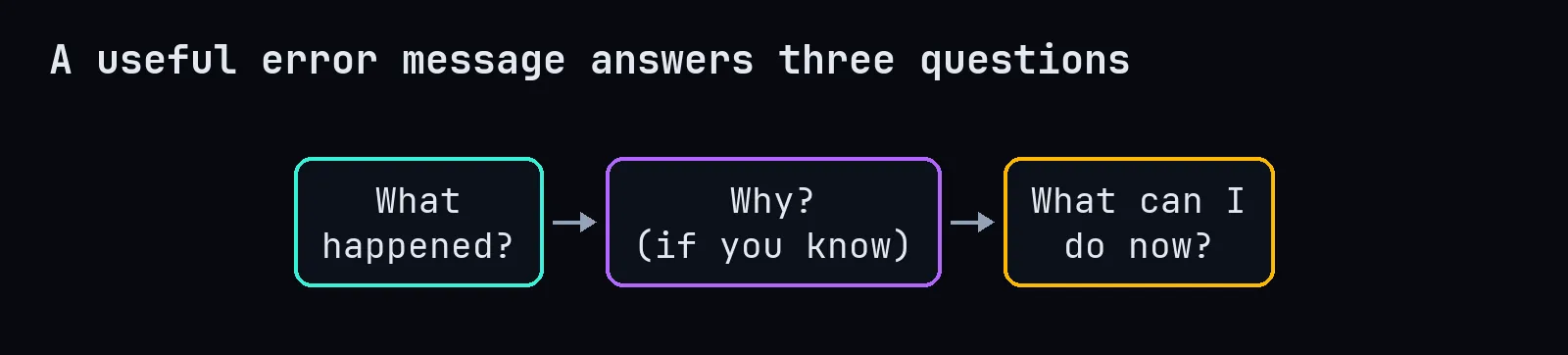
That last sentence, "you haven't been charged," removes the user's biggest fear. Good error messages answer the anxious question, not just the technical one.
Server failure
- Before: "Something went wrong."
- After: "We couldn't save your changes because of a problem on our side. Your text is still here, so you won't lose it. Try again in a minute."
The rules
- Say what happened in plain words. No error codes as the main message. Put codes in small text for support teams.
- Don't blame the user. "You entered an invalid date" feels accusatory. "Please use the format DD/MM/YYYY" helps.
- Be specific. If you know which field is wrong, say which field.
- Offer a way forward. A button to retry, a link to reset the password, a support contact.
- Protect their work. Never clear a form because of one error. Losing a long form is the fastest way to lose a customer.
- Put the message where the problem is. Show field errors next to the field, not in a red box at the top of a long page.
- Match the seriousness. Jokes are fine on a 404 page. They're not fine when someone's payment failed.
For developers: design errors in your code too
Good user-facing messages start with good internal errors. If your backend only knows "error," the frontend can only say "something went wrong."
class PaymentDeclined(Exception):
    user_message = "Your bank declined this payment. You haven't been charged."

class AddressNotFound(Exception):
    user_message = "We couldn't find that postcode. Check it or enter your address manually."
Map specific failures to specific, human messages, and log the technical details separately for yourself.
Accessibility
Don't use colour alone (a red border) to show an error. Add text and an icon. Make sure screen readers announce errors, for example with aria-live regions or by linking the message to the input with aria-describedby.
The mindset shift
An error message is a conversation with someone who's having a bad moment. Write it the way a kind, competent person at a help desk would talk: clear, calm, specific and focused on fixing it. "Something went wrong" is what you say when you don't care. Your users can tell.