Visualisation Sins I Have Committed
Forgive me, readers, for I have charted. It has been several years since my last pie chart. Here are my sins, and how I atoned for them.
Sin 1: The truncated axis
I once showed a bar chart where our product's satisfaction score towered over a competitor's. The y-axis started at 95%. The real difference was less than one percentage point. The room was very impressed, which is exactly the problem.
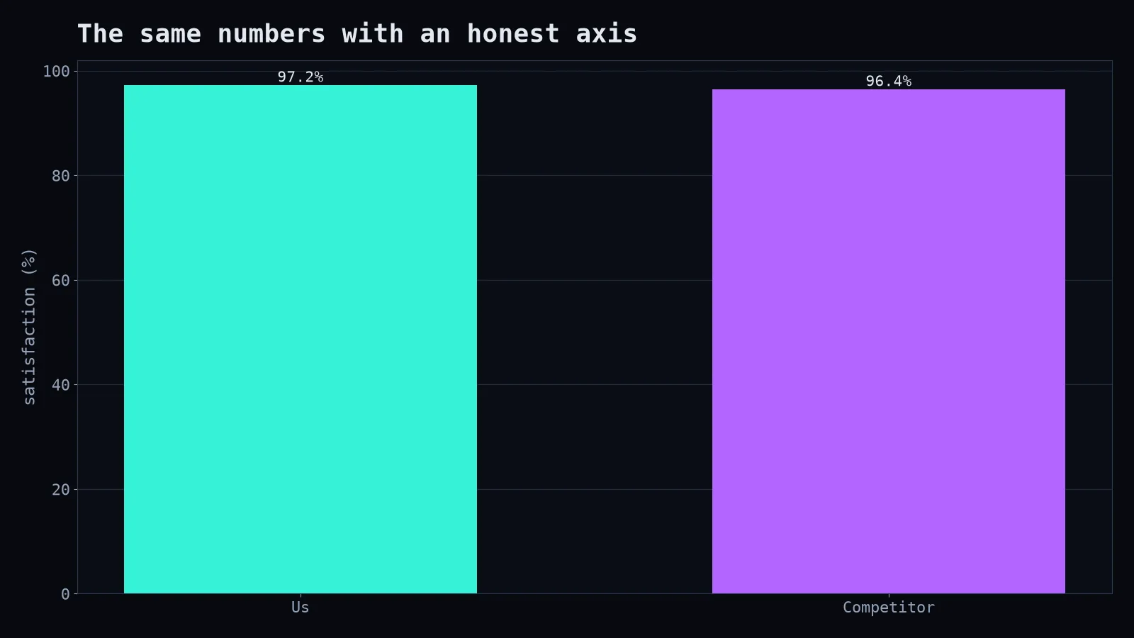
Atonement: bar charts must start at zero, because we read bars by their length. Line charts can zoom in, because we read them by their slope, but label the axis clearly.
Sin 2: The 3D pie chart
Pie charts are already hard to read: humans are bad at comparing angles. Add 3D perspective and the slices in front look bigger than the slices at the back. A 3D pie chart is a chart wearing sunglasses indoors.
Atonement: use a sorted horizontal bar chart. Every comparison becomes instant.
Sin 3: The rainbow colour map
For a heatmap, I used the full rainbow. It looked festive. Unfortunately, rainbow colour maps create fake boundaries (yellow pops out even if the values barely change) and are unreadable for many people with colour vision deficiency.
Atonement: use perceptually uniform colour maps like viridis or magma for continuous values, and a diverging map (blue-white-red) only when there's a meaningful midpoint like zero.
Sin 4: The legend scavenger hunt
Twelve lines, twelve colours, a legend in the corner. The reader's eyes ping-pong between the line and the legend until they give up.
Atonement: label lines directly at their ends, and grey out everything except the two or three lines that matter. Highlighting is a superpower.
for name, series in data.items():
    highlight = name in ("Canada", "Bangladesh")
    ax.plot(series, color="#35f2d6" if highlight else "#cbd5e1", linewidth=3 if highlight else 1)
    if highlight:
        ax.text(len(series) - 1, series[-1], f" {name}")
Sin 5: Dual y-axes
Two different measures on two different scales, sharing one chart. By adjusting the scales, I could make them look correlated, uncorrelated or in love. Dual axes let the designer choose the story, not the data.
Atonement: two small charts, one above the other, with a shared x-axis.
Sin 6: The chart without a point
A beautiful chart with a title like "Revenue by Month." Okay. And?
Atonement: titles should state the takeaway: "Revenue grew every month except April, when the payment outage happened." The chart then becomes evidence for a sentence, which is how people actually remember things.
Sin 7: Too many decimals
"Conversion: 3.14159%." Nobody needs that precision, and it implies accuracy the data doesn't have. Round to what matters.
The penance
Before sharing any chart, I now ask three questions: What is the one thing I want people to notice? Would someone get it in five seconds? Could this chart mislead someone, even accidentally? If any answer is uncomfortable, I redraw it. Go forth and chart honestly.