Dashboards Nobody Opens: A Tragedy in Three Acts

Act I: The Request
A senior manager says, "We need a dashboard." Nobody asks what decision it will support. The team collects every metric that exists, plus a few that are invented for the occasion. Requirements are gathered. Colours are chosen. Someone asks for a map.
Act II: The Build
Three months pass. The dashboard has 40 charts, 11 filters, 6 tabs and a loading time long enough to make tea. It's beautiful. It's launched with an email.
Act III: The Silence
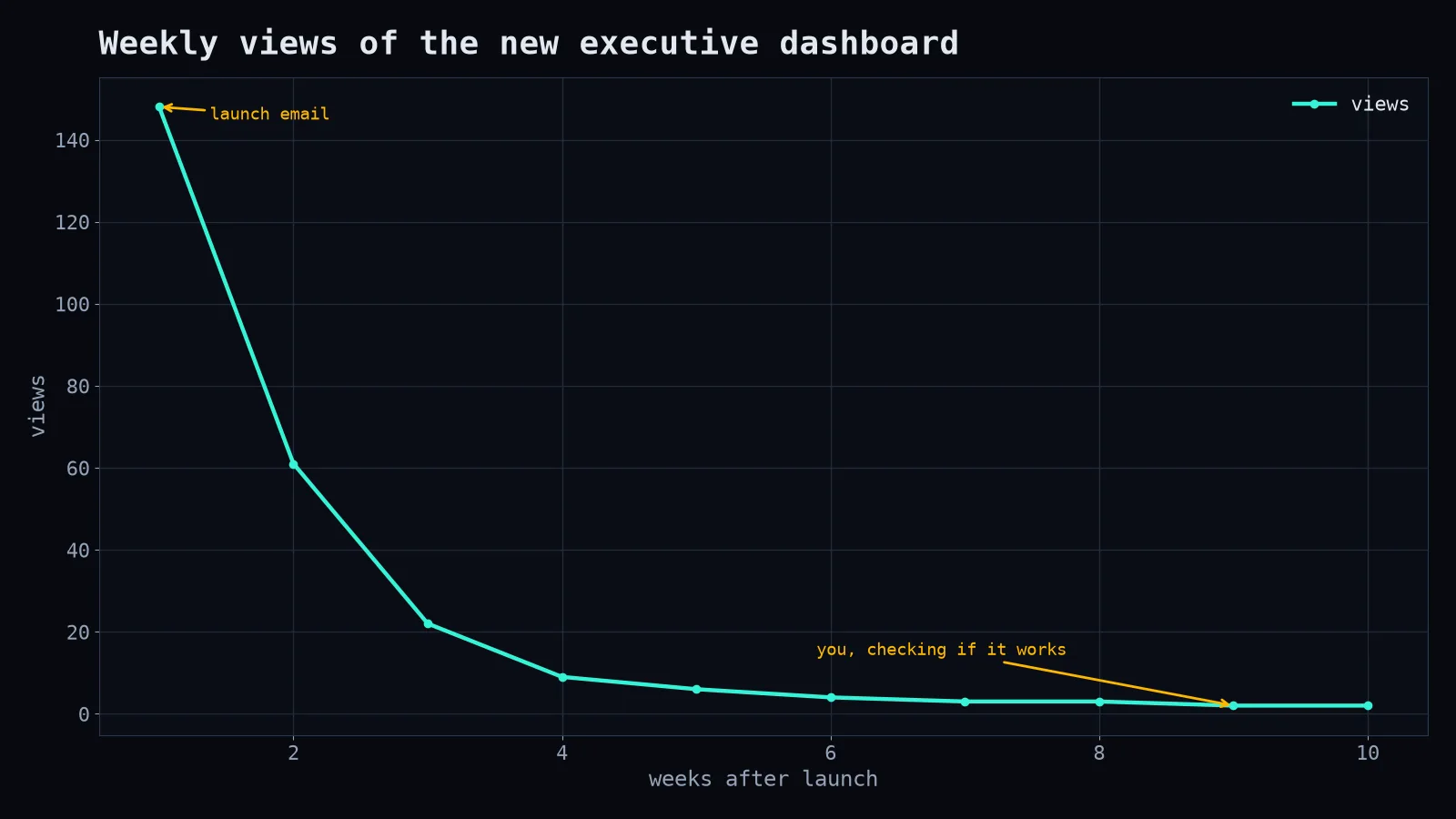
Week one: lots of curious clicks. Week four: a few. Week ten: you, opening it to check that the data pipeline still runs. The manager now asks for the numbers in a spreadsheet. By email. Every Monday.
What went wrong
The dashboard answered every question except the ones people actually had. More precisely, it answered no question at all. It displayed data. Displaying data is not the same as helping someone decide something.
How to build one people use
Start with decisions, not metrics. Ask: "What will you do differently depending on what this shows?" If the answer is "nothing, I just like to know," you need a monthly email, not a dashboard.
Fewer numbers, more context. A number alone means nothing. Compare it with something: last week, the target, the same week last year.
- Bad: "Signups: 1,240"
- Good: "Signups: 1,240 (−18% vs last week, below target of 1,500)"
Put the most important thing top-left. People read screens like a page. The question the dashboard exists for gets the best spot, in a big font.
Five to seven charts, maximum. Everything else goes in a "details" tab that 3% of people will open, and that's fine.
Make it fast. If it takes 20 seconds to load, it won't be opened casually. Pre-aggregate data; nobody needs row-level detail on the summary page.
Explain definitions. "Active user" means four different things in four different teams. Put the definition right next to the number.
Alert, don't wait to be looked at. If something important crosses a threshold, send a message. The best dashboard is sometimes a Slack notification that says "conversion dropped 30% today, here's the chart."
Measure your dashboard like a product
Track views, users and which charts get clicked. Talk to the people who stopped visiting. Remove charts nobody uses. A dashboard is a product, and products without users should be improved or retired, not defended in meetings.
The epilogue
The most successful "dashboard" I ever made was a single number on a single page, with a sentence underneath explaining what it meant and what to do if it went red. It got opened every morning for two years. It took a day to build. Sometimes the tragedy is just that we made it too complicated.