Storytelling with Data: The Chart Is Not the Story
I once presented 34 slides of charts to a leadership team. Every chart was accurate. Every chart was well designed. At the end, the CEO asked, "So what should we do?" I didn't have a slide for that.
That was the day I learned that analysis isn't finished when the chart is correct. It's finished when someone knows what to do.
Data dump vs data story
A data dump says: here is everything we found. A data story says: here is what's happening, why it matters, and what we recommend.
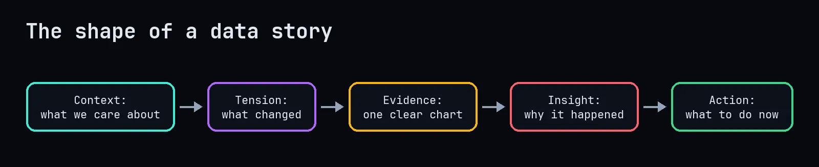
1. Start with what the audience cares about
Not "I analysed 2.3 million events." Instead: "We're losing about a quarter of new customers within three months, and that's costing us roughly what we spend on marketing."
Now they're listening, because you've connected the data to something they're responsible for.
2. Show the tension
Every good story has a problem. In data stories it's usually a change, a gap or a surprise: something went down, two groups behave differently, a target is being missed.
3. One clear chart per point

Notice the title. It doesn't say "Retention by onboarding status." It says what the chart proves. If someone only reads the title, they've still got the message.
4. Explain the why
The chart shows what. Your job is to add why, carefully. "Customers who skip onboarding never set up their second user, and our product is much less useful for a single person." Back it up with evidence, and be honest about what's correlation and what you've tested.
5. End with an action
A recommendation, with its expected impact and its cost:
Make onboarding mandatory for new accounts and add a "invite a teammate" step. If it closes even a third of the gap, we'd keep around 300 more customers a quarter. We'd like to test it with half of new signups for four weeks.
That last line matters: propose a way to check you're right.
Practical habits
- Write the headline sentences first, then find the charts that support them. If you can't write the sentence, you don't have a finding yet.
- Put details in an appendix. Your methodology slide is for the one person who asks.
- Use plain language. "Statistically significant at p < 0.05" becomes "this is very unlikely to be a coincidence."
- Anticipate the obvious question ("is it just seasonality?") and answer it before it's asked.
- Rehearse with someone outside the team. If they can't repeat your main point afterwards, simplify.
The real goal
People don't remember charts. They remember stories, and they act on recommendations they understand. The data gives your story its credibility. The story gives your data its consequences. You need both, but if you only remember one thing: always have a slide for "so what should we do?"